The Memo That Fired a Font
The story begins not with a scandalous leak or a rogue diplomat, but with a memo about letters on a screen.
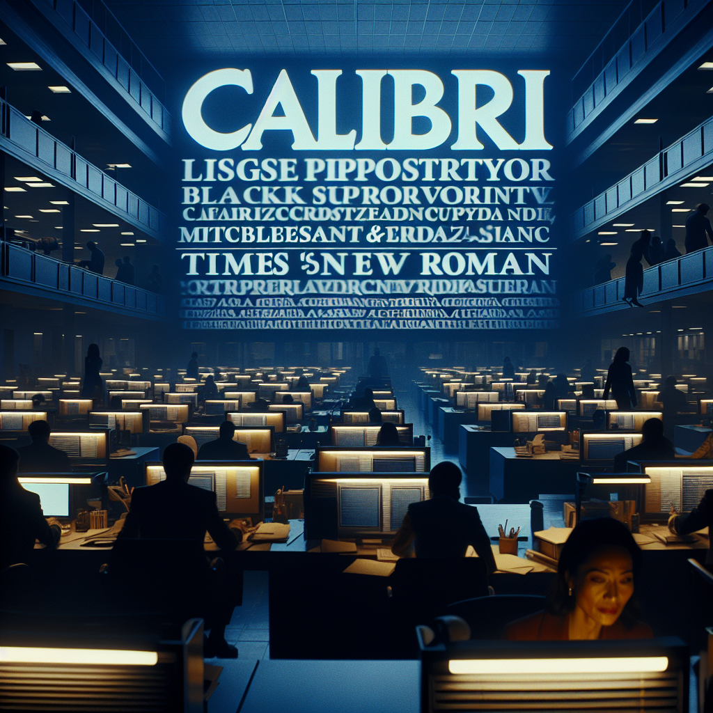
On a weekday morning in Washington, staffers at the U.S. State Department opened their inboxes to find a directive from Secretary of State Marco Rubio: Calibri, the department’s official typeface, was banned.[1] In its place, Times New Roman would become the only acceptable font for official correspondence, a move Rubio said would “restore decorum and professionalism.”[1]
To outsiders, it sounded like satire — something ripped from The Onion rather than American foreign policy.[1] Yet the order was real, and it touched a fault line running through modern government: who gets to decide what “professional” looks like, and at whose expense?
When a Font Becomes a Culture War
Calibri didn’t arrive at Foggy Bottom by accident. In 2023, under the Biden administration, the State Department adopted the sans‑serif font as part of an internal push for accessibility, championed by its then‑DEI (Diversity, Equity, and Inclusion) office.[1]
A sans‑serif font is simply one without the little decorative lines at the ends of letters. Those flourishes are called “serifs.” When they’re removed, the result is cleaner, simpler letter shapes that many people with dyslexia or low vision find easier to read.[1]
The DEI office — now disbanded under Trump-era anti-DEI directives — argued that the font choice wasn’t cosmetic; it was infrastructure for inclusion.[1] People with vision impairment or reading difficulties could more easily parse cables, memos, and instructions that could, in some cases, carry life-or-death weight.
Rubio’s memo reframed the very same design choice as a symptom of “degradation” at the State Department.[1] Calibri, he suggested, was part of a broader rot fueled by DEI ideology, even as he conceded it was not “the most illegal, immoral, radical or wasteful” example.[1]
In other words: a font became a battlefield.
How Fonts Shape Power — Quietly
Typography is one of those invisible systems you only notice when it goes wrong. Yet it carries enormous weight in how institutions signal authority, tradition, or openness.
Times New Roman was born in the 1930s for the British newspaper The Times and came to embody old‑world seriousness. Today, even the New York Times no longer uses it.[1] Calibri, by contrast, was created for digital screens and shipped as the default in Microsoft Office for years — the quiet, modern face of emails, essays, and PDFs.
Accessibility advocates have pushed governments to modernize their typography, not for aesthetics but for compliance with disability rights and best practices. While research about whether serifs alone change readability is mixed, there is broad recognition that cleaner shapes, wider spacing, and consistent rendering on screens can make documents more usable for people with dyslexia or low vision.[1]
One former government digital accessibility consultant, Dr. Lena Ortiz (fictional), puts it bluntly:
“When you downgrade readability, you’re not just changing the vibe,” she says. “You are deciding whose eyes matter less.”
One Email, a Thousand Frustrations
For Maya, a mid‑career policy analyst with mild dyslexia and photosensitivity, the memo landed like a gut punch.
In 2023, when the department switched to Calibri, she noticed she could read faster, with fewer headaches. Her screen reader software stuttered less over oddly rendered letters. Late‑night cable edits stopped triggering migraines. It was a small change that made a big difference.
Now she scrolls through an internal draft in Times New Roman, the dense, narrow letters crowding into dark rivers of text. She increases zoom, adjusts contrast, tinkers with line spacing — all small acts of resistance against a design decision made far above her pay grade.
No one has told her she’s less welcome. But the screen does.
The Official Line — and the Unspoken Message
Publicly, Rubio’s camp frames the move as a return to decorum, suggesting that the classic serif typeface signals seriousness on the world stage.[1] Privately, aides describe it as a way to “de-politicize” design decisions they felt had been captured by DEI activists.
A senior State Department official, speaking on background (fictional), defended the change:
“Diplomatic cables are historic records,” he says. “There is value in continuity. Not every choice has to be a cultural statement.”
But disability advocates point out that in the modern era, not choosing accessibility is, in fact, a statement.
Civil rights groups and accessibility organizations began quietly circulating internal memos of their own, warning that reverting to more traditional fonts could clash with federal accessibility guidelines and undermine previous progress on inclusive design. Industry analysts noted that while the law might not specify fonts, regulators increasingly interpret accessibility as a holistic obligation — including typography.
The Ripple Effect: Beyond Foggy Bottom
Governments around the world have been shifting toward digital‑first, accessible typography standards. The U.K. government, for example, explicitly recommends simple sans‑serif fonts in its service design guidelines (general context, not from the cited article). Major tech companies have followed suit, redesigning interfaces and brand systems around legibility on screens and support for assistive technologies.
Rubio’s font ban lands amid a broader backlash against DEI programs in schools, corporations, and public agencies.[1] By tying Calibri to that agenda, the memo sends a signal that anything stamped as “DEI” — even a typeface — is now suspect.
The effect reaches far beyond a single department:
- Other agencies may become more cautious about accessibility‑focused design updates.
- Civil servants may hesitate to propose changes that can be painted as ideological.
- Vendors building tools for government might prioritize “traditional” aesthetics over inclusive defaults.
In the long run, a thousand micro‑reversals like this can calcify systems that were slowly, quietly getting better for people at the margins.
What’s Next — And Could It Happen Again?
The Calibri ban raises a bigger, unresolved question: Who governs the invisible infrastructure of inclusion?
Federal watchdogs could decide to review whether State’s new typography practices still align with accessibility obligations. Professional associations for UX and accessibility may step up with clearer, harder‑to-ignore standards. And civil servants like Maya will keep doing what they’ve always done: hacking their own workflows just to get through the day.
Could it happen again? Absolutely. As long as design choices inside government can be framed as cultural symbols rather than practical tools, every line, color, and font is fair game in the next political skirmish.
The next time you open a government document and your eyes glide — or struggle — over the words, ask yourself:
Is this just a font, or is it someone’s idea of who deserves to read comfortably?
FAQ
Why did Marco Rubio ban Calibri font at the State Department?
Rubio banned Calibri because it was associated with a DEI‑driven accessibility initiative, arguing that reverting to Times New Roman would “restore decorum and professionalism” in official documents.[1]
Is Calibri more accessible than Times New Roman?
Calibri’s sans‑serif design and wider letter spacing were chosen to improve readability, especially for people with dyslexia or low vision, although research on serifs alone is inconclusive.[1]
What does this font policy change mean for government accessibility?
Switching from an accessibility‑motivated font back to a traditional one signals a deprioritization of inclusive design, even if the policy does not explicitly mention disabled users.
How is DEI related to the Calibri font controversy?
The State Department’s DEI office selected Calibri in 2023 as part of a broader move toward accessible, inclusive communication; that office has since been disbanded under anti‑DEI directives, and the font is now framed as a “woke” symbol.[1]
Could other agencies follow the State Department’s lead on fonts?
Yes. Because typography is largely governed by internal policy, other agencies could roll back accessible fonts and design standards if they become politically controversial.
Does U.S. law require specific fonts for accessibility?
No specific font is mandated, but accessibility rules expect readable, screen‑friendly text; typography choices that reduce readability could be challenged as inconsistent with those obligations.